

Overview
Health is something we all take for granted until one day we’re not okay. It’s a scary feeling when our bodies don’t act the way they’re supposed to. Scarier still is not knowing why it’s happening, and more frightening than that is to be diagnosed with a chronic condition that you’ll be living with for the rest of your life.
This is the reality for the 366 million people world wide who are living with type 2 diabetes. For them, health is constantly top of mind and they truly need to employ a lifestyle change if they want to remain healthy. It can be a daunting task to take control of one’s own health, but for them it’s not an option. And luckily, they’re not alone.
Wellsmith is a health tech company that’s looking to revolutionize care for patients suffering from Type 2 diabetes. By creating a digital health management platform, they have a goal to automate as much patient prioritization information as possible while also engaging them with simple health guidance. A consumer facing app paired with a healthcare worker database, Wellsmith is looking to change the way patients think about and interact with healthcare.
The Task
Refine wireframes and design the interface of a B2C healthcare tracking application for Android. Upon approval, deliver a design system guided by principles and best practices. Wellsmith was looking to make healthcare feel friendly and accessible, to put initiative into the hands of patients. The design needed to reflect that need and help people feel like their health was manageable in a fun way.
Deliverables // Various Screens, Design System, Onboarding illustration assets
Category: User Interface, User Experience
Client: Wellsmith, 2018
Tools: Sketch, Illustrator
Role: Visual Design
Partners: Diana Gonzalez (User Experience), Jeff Petry (Product Manager)

Wireframes
I began the project with client-delivered wireframes, and the skeletal framework allowed me to get a basic understanding of the app functionality. Wireframes had already been approved within the organization, so I avoided making any drastic changes. What I did do was re-organize some sections to emphasize information that would be most important to the user.

Visual Design Thinking
I started the project with wireframes and one persona, but the team left me with an open canvas in an effort to help me design without bias or constraint. What I did know about users was that they were generally not tech savvy, operated mostly on Android devices, and typically skewed a bit older. With this knowledge, I delivered two separate but related concepts with the following design decisions:
Use of Google’s Material Icon Set: I wanted to use a set of icons that had a high probability of being familiar to users. Since they weren’t tech savvy, I wanted as little ambiguity as possible.
Special attention to accessibility in buttons: I made sure that tier 1 important information was designed to be WCAG AAA accessible, with large enough buttons. Users were older and so the easier it was to both see and use the buttons, the better.
Typeface Roboto: This was the client’s brand typeface.
Time constraints included a quick turn around at about 10 hours of time. I also added my own personal constraints to adhere to the principles of user centered design and rules of accessibility. Throughout the process it was important for me to remember one user goal: turn something complicated into something simple, usable, and intuitive.

Client Feedback
Reaction to the initial mockups was positive when it came to the structure and layout changes, but Wellsmith wanted a more unique look and feel. They also had me mock up an onboarding and messaging screen to get a more complete picture of what their app might look like. Notable feedback included:
Design a set of custom icons rather than using Material Icons for a unique look and feel.
Update to a warmer color scheme to communicate friendliness.
Find a way to incorporate a set of client-provided gamification characters throughout the experience.

Color Palette
I selected primary colors based on function. By far the most used color is the creme, which in large use, balances out some of the more colorful colors as a warmer background color. The darker purple serves as an accessible utility color, and the orange is used to highlight areas of importance. The tertiary colors were selected to represent glucose (blue), activity (yellow), nutrition and weight (green), and medicine (red).
Typography
Wellsmith views their app as a partner to their users, and the typeface needed to reflect the friendly nature of that interaction. I opted for the circle based Avenir which had was readable, versatile, and had just enough character to change ‘hello’ into ‘hi there’.
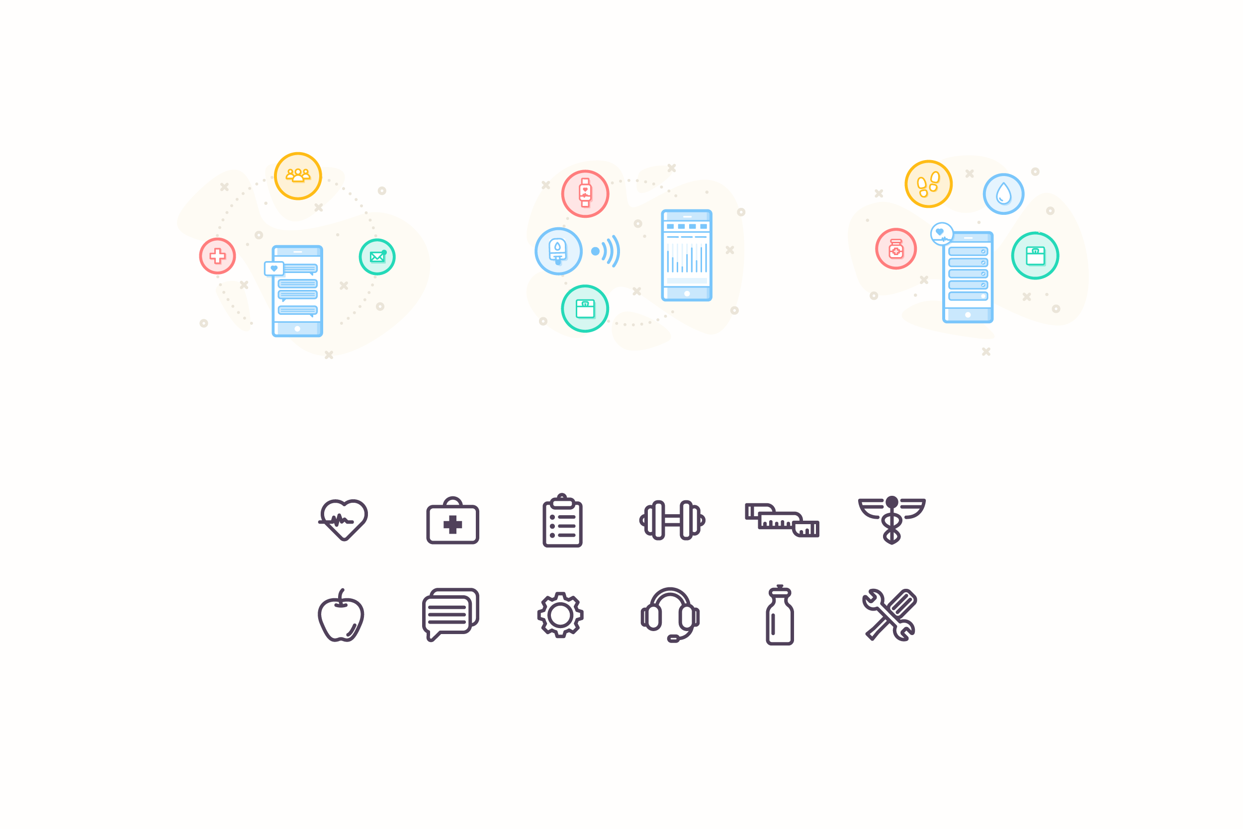
Iconography
The icons are an important part of the design. They reinforce users’ understanding of what can be complicated information. By incorporating symbols that translate quickly into the four main categories of information, the design allows users to focus on results rather than trying to understand their data. Furthermore, they allow consistency of the visual aesthetics that help build the users’ trust and produce moments of delight.

Design System
Creating a design system helped to insure that the design decisions made and approved would remain consistent throughout the app and across multiple teams of designers. Serving as a source of truth, it is integral to making sure the app employs a consistent style and visual language. A design system also helps to accelerate workflow because it makes it easy to stay consistent across a design team.
Design systems are living breathing organisms and this is only intended to be the beginning. As the project comes to fruition, internal designers should revisit this system often and make updates as necessary.
Assets
Following the design system, the project was handed off to the client to be built out internally. While he focused on designing the UI, Wellsmith approached me about creating a series of on-boarding illustrations as well as more iconography. Styles remained consistent with the style that was already set by the design system.
Conclusion
This project has allowed me to gain a solid understanding of UI design patterns and was incredibly fun to bring to life for an amazing client. It was clear from the onset that one of the major challenges would be to visually represent complicated data in a digestible and fun way. I believe we have succeeded in creating something that could have a positive impact on many lives.
Next steps that I might have taken had a I remained on the project would have been:
Building out the full application (MVP)
Usability testing and iteration
Streamline user flow
Deep research about specific features
**This product is slated to launch in May of 2019 and is currently under NDA.